


Fluent XAML Theme Editor Preview released!


We’re excited to announce the preview release of the Fluent XAML Theme Editor application!
As some of you may remember from our Build 2018 session this year, we previewed a tool using our new ColorPaletteResources API that allows you to set the color theme of your app through some simple color selections.
This tool is now publicly available to insiders and those running on pre-release builds (Windows 10 SDK Preview Build 17723 or newer) to test out on our GitHub repository!
How to use the Fluent XAML Theme Editor
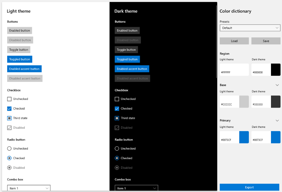
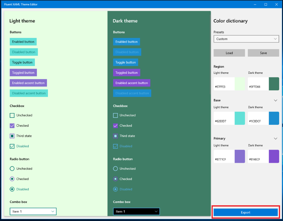
With the preview build, you can select three major colors for both the Light and Dark themes in the right-hand properties view labeled “Color Dictionary”:
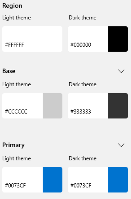

- Region – The background that all the controls sit on, which is a separate resource that does not exist in our framework.
- Base – Represents all our controls’ backplates and their temporary state visuals like hover or press. In general, Base should be in contrast with the background (or Region color) of your theme and with black text (if in Light theme) and white text (if in Dark theme).
- Primary – This is essentially the Accent color and should contrast with mainly white text.
It is used in more choice locations to show alternate rest states for toggled controls like list selection, checkbox or radiobutton checked states, slider fill values, and other control parts that need to be shown as different from their default rest state once interacted with.
Refining the colors
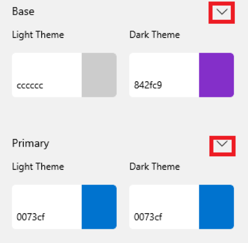
In addition to the three major colors for each theme, you can also expand any one of the major colors to see a list of minor colors that change the color on certain controls on a more refined level.
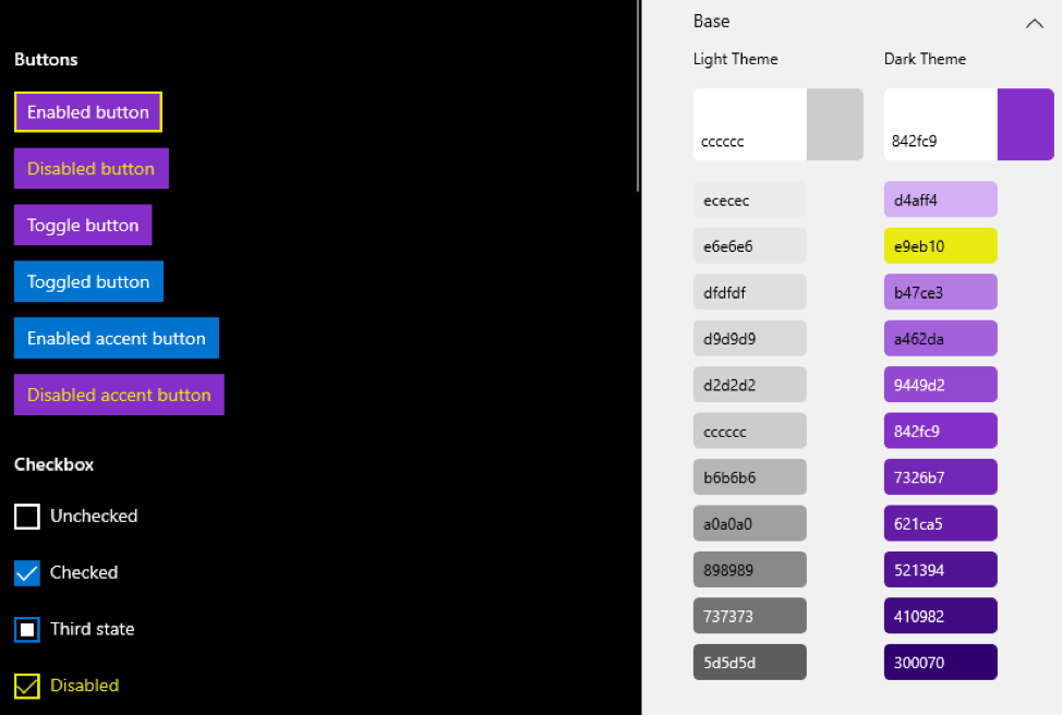

In the above example, you’ll notice that although my major Base color is purple in Dark Theme, I can override that second gradient value to be yellow to change the borders and disabled color of controls.
To access the detailed view of colors, simply click the chevron next to the major color buttons:

Creating, saving and loading presets
The editor will ship with some presets for you to look at to get an idea of what a theme looks like in the app.
The preset dropdown is located at the top of the Color Dictionary properties panel.

When you first boot up it will always be set to Default – which is the Light and Dark theme styling default for all our controls. You can select different themes like Lavender and Nighttime to get an idea of how the tool will theme our controls.
Once you’re ready to start making your own theme, just start editing the colors! Once you’ve started tweaking them, you’ll notice that the Presets ComboBox goes from the name of the preset to “Custom”:
This means that you’ve started a new temporary theme that’s “Custom.” Any changes you make will not affect any of the other Presets in that box.
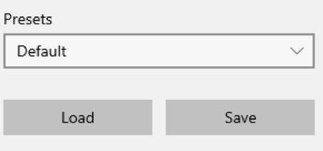
- Once you’re satisfied with the changes you’ve made, simply click the “Save” button and browse to your desired save point.
- Similarly, you can open your saved JSON theme by clicking the “Load” button and browsing to your saved theme’s file location.
Contrast Ratio Checking
Lastly, one of the most important parts of creating your theme needs to be making sure that in either respective theme you are contrast compliant. The tool provides you with a small list of contrast information on the left-hand side of the color selection window when choosing your color.
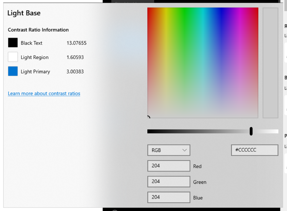

In this window you can see your contrast with the most prevalent text color in the theme that you’re choosing to edit, in the above case black text because you are editing a Light theme color value.
When you pick a color that falls below the standard contrast ratio of 4.5:1, you’ll be alerted with red text next to your contrast value.
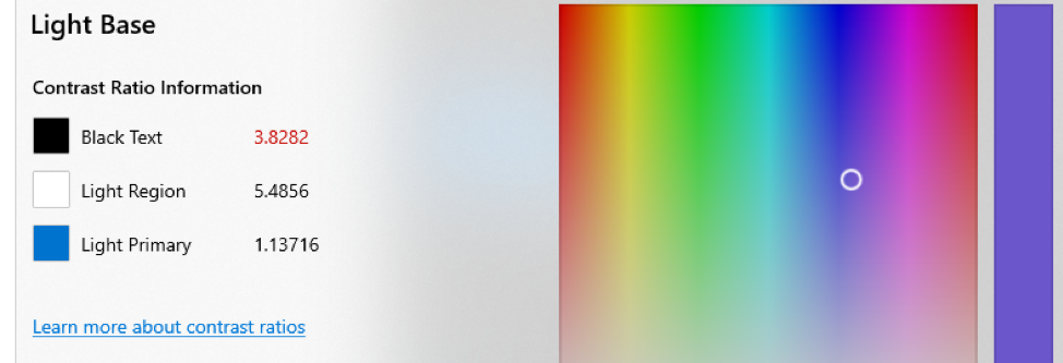

You can learn more about contrast ratios and their importance here.
Exporting and using your theme in an app
Of course, once you’ve themed everything, you’ll want to use in your app! To do that you’ll need to click the “Export” button at the bottom of the Color Dictionary properties panel.

That button will open a popup window with a generic, unnamed ResourceDictionary stub (seen below).
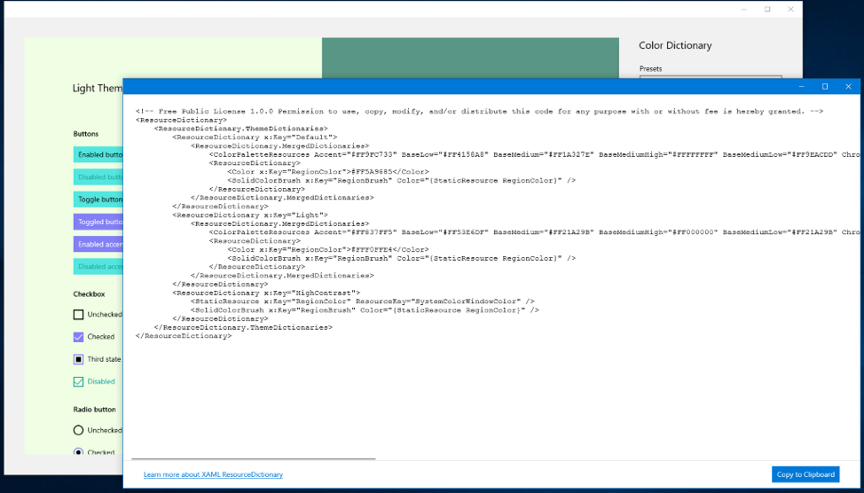

This window doesn’t make anything final, however, if you want to make some changes to the theme and re-export them to the Export window, it will refresh with your changed colors.
Once you’re ready to use it in your app, click the “Copy to Clipboard” button in the lower right corner and go to UWP Visual Studio solution.
Once in Visual Studio, right-click on the project solution, located in the Solution Explorer.
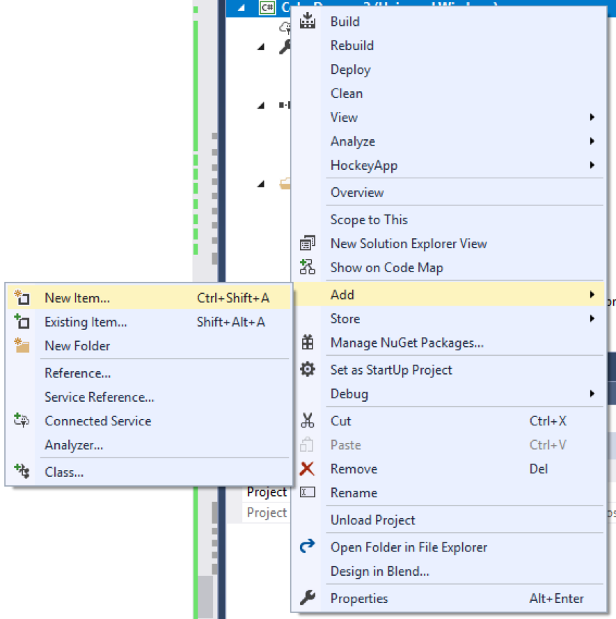

And go to Add > New Item and then choose Resource Dictionary.
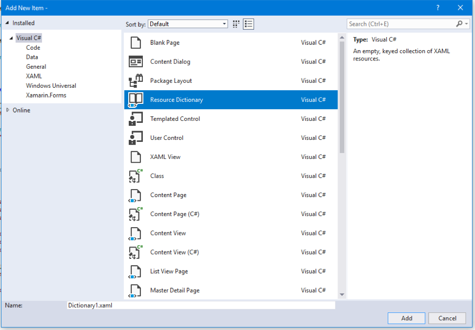

Name that dictionary whatever makes sense to you and click Add when you’re done.


That should generate a blank ResourceDictionary like this:
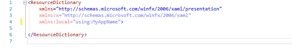

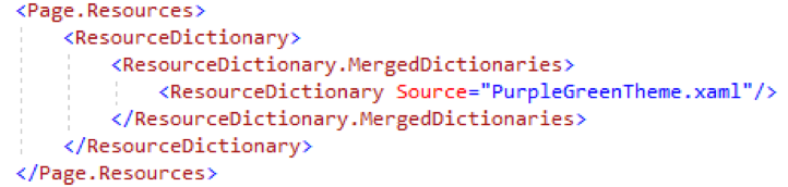
Now you can paste the exported theme code from the editor into that ResourceDictionary.

Now you have a fully customized color theme waiting to be use, so let’s apply it!
To do that, you’ll want to go into your page or app.xaml (depending on how much of your app you want the theme to apply to) and merge your theme dictionary into the resources of that page or app.

Lastly, don’t forget to set the background color of your page to the RegionColor that you picked for your theme. It’s the only brush that won’t get set automatically.
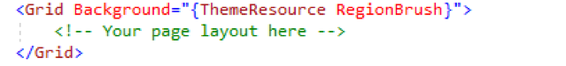

Once that’s in, you’re done! Your theme colors will now be pervasive across your app or page depending.
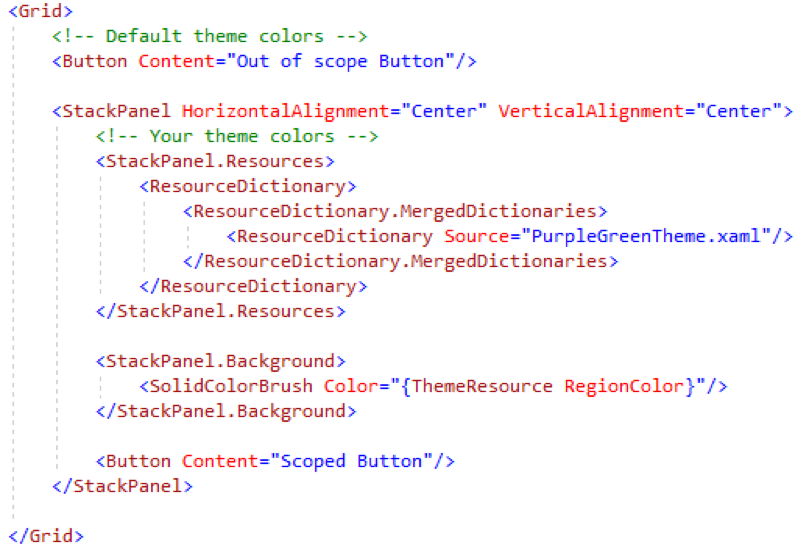
Scoping your theme
If instead you want to scope your theme colors to a smaller area, you can also put all that power into just a container (Like Grid or StackPanel) and the theme will scope to just the controls that live within that container:

Using your theme down-level
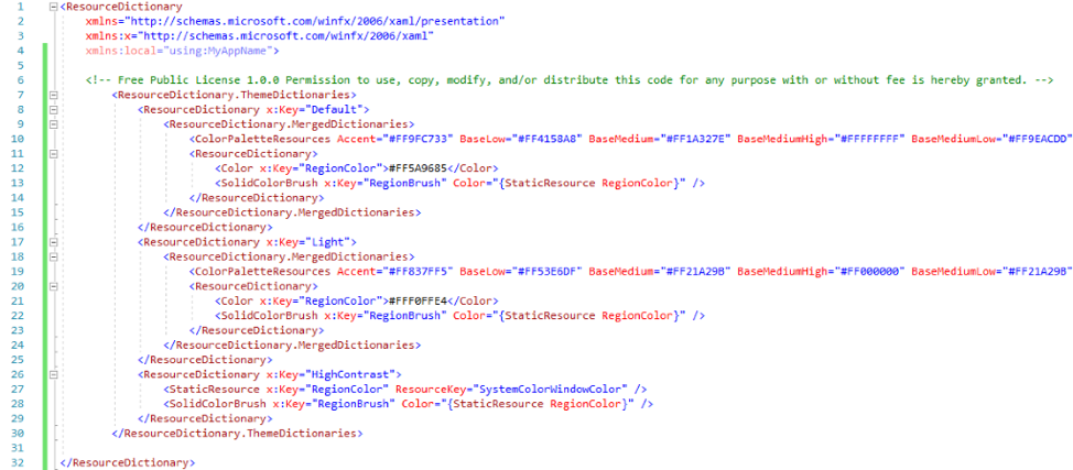
When you export your theme, you’ll see a ResourceDictionary markup with a ColorPaletteResources definition like this:
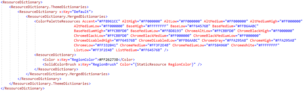

ColorPaletteResources is a friendly API for our SystemColors that sit within generic.xaml and allows for those SystemColors to be scoped at any level.
If you wanted to enable this same theme to work downlevel, you would have to define each SystemColor individually with each color from your theme:
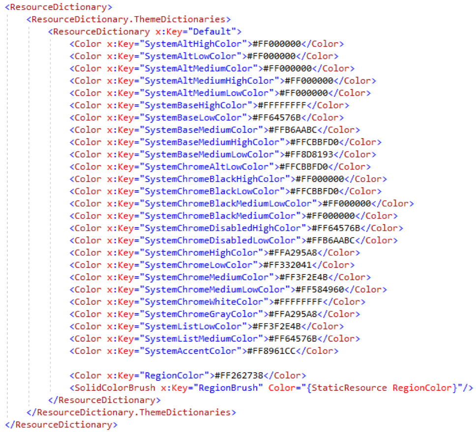

In the above case we’re using the Lavender theme to show this down-level transition.
Warning: Although this markup format change will enable your theme to be applied across controls in earlier SDK versions, it will not work on a page, container or control scoped level. ColorPaletteResources is the API that allows scoping behavior. This markup format will only work at the app.xaml level for earlier SDKs.
Get started today
To use the Fluent XAML Theme Editor preview now, head on over to our GitHub repo for the app. There you can download the source to the app and get started with what it has to offer!
Source: Fluent XAML Theme Editor Preview released!