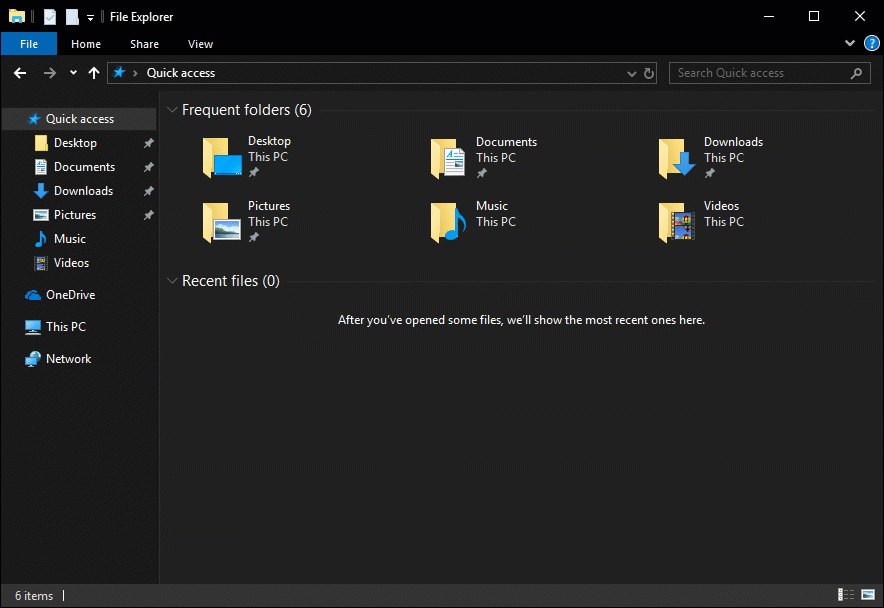
Windows 10 Tip: Dark theme in File Explorer

Did you know you can change File Explorer to a theme that’s easier on the eyes, thanks to the Windows 10 October 2018 Update?
As the Windows Insider blog explains, “Adding a dark theme to File Explorer has long been a top Insider request,” but it meant “breaking new ground to provide a dark theme to legacy parts of the shell.”
The post goes on to explain the process of creating and refining the UI design, with the help of Windows Insiders’ feedback.
“For example, Insiders told us that they’d like to see more use of grey tones — which we added to areas like the view pane. We also adjusted the address bar and ribbon colors. (The effect is that your eye is drawn more to the content in the center of the screen.) And take a close look below at the Navigation Pane. We removed the folder backplates from the folder icons and enlarged the icons to make them stand out more on high DPI displays.”
Detailed suggestions like these helped the team move from a basic dark theme into the kind of functional design that users demand with applications like File Explorer.
Want to try out dark theme on your PC? Go to Settings > Personalization > Colors, scroll to the bottom of the page and change the default app mode from Light to Dark.
Check it out in action:
If you’re using the Windows 10 October 2018 Update, File Explorer will automatically update from light to dark after you change this option. To confirm whether or not your PC is running this version, you can go to Settings > System > About, where it will say Version 1809 in the Windows Specifications section. If you see Version 1803 or a lower version number, the Windows Update Assistant can help you update to the latest version of Windows 10.
Check out more Windows 10 Tips.
The post Windows 10 Tip: Dark theme in File Explorer appeared first on Windows Blog.