Beautiful apps made possible and easy with Windows.UI

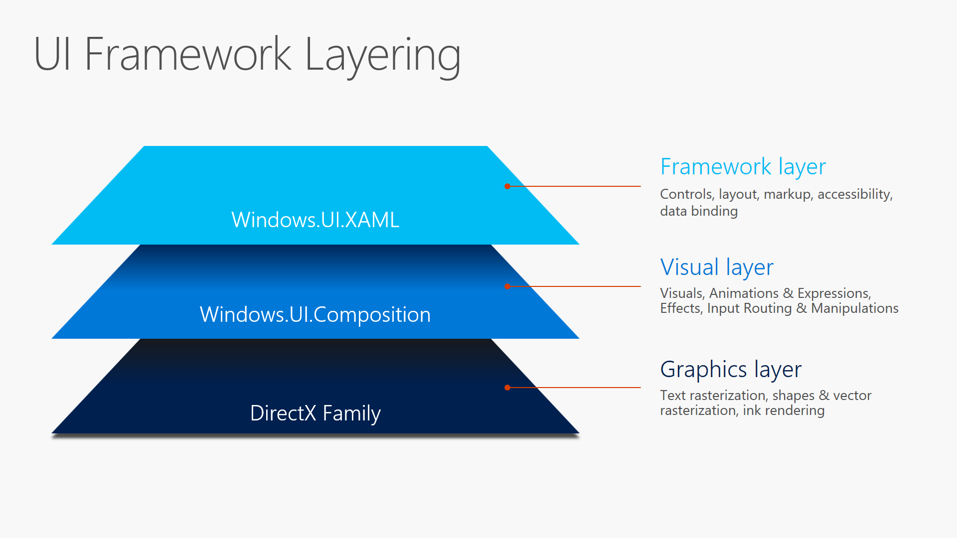
If you are into creating sweet UI, then you’re definitely going to want to dig into the new Visual Layer with Windows.UI.Composition. The Windows.UI.Composition namespace allows Universal Windows Platform (UWP) developers to use a new Visual Layer that will get them closer to the metal, graphically speaking, while still using familiar technologies like XAML and C#. By getting closer to the metal, actually down to the system compositor level, developers are able to get great visual performance and custom UI experiences. By working through the XAML layer, developers get the ease of use they have come to expect out of UWP. This is basically a best of both worlds scenario that puts great responsibility in the developer’s hands. And with great responsibility, as we all know, comes great power.

Windows.UI.Composition first debuted in the Windows 10 November 2015 update. With the Anniversary edition, it is getting a whole host of new effects, such as the blur effect, as well as new animation capabilities such as:
Light
A Composition Light supports ambient, distant, point and spot lights. When these lights target a visual, the visual and all of its descendants are aware of and respond to this light source. A SceneLightingEffect describes how content responds to light with reflective properties and providing an illusion of depth with a normal map.
Shadow
Shadows are here. Rectangular shadows are the default, but if you supplying a mask, a DropShadow will mimic your contents shape
BackdropBrush
You can use a BackdropBrush to apply an effect (or a chain of effects) to a region behind a SpriteVisual. For example blurring the background behind a single element you want to focus attention on.

So why do you need all these graphical and UX superpowers? In addition to giving pizzazz to your UWP apps, access to the system compositor level also helps your users to accomplish their tasks faster and more fluidly. For instance, when you use Composition effects to blur a background in response to a click, you are focusing the user’s attention on her current task and removing distractions. This is the sort of subtle UI implementation that actually makes your user’s life easier – and it works best when your user doesn’t even know that you did anything for them. They are just left with the impression that your app is easy to use and feels fast, even if they can’t exactly put their finger on the reason.
The Visual family
To better understand the basic principles of Windows.UI.Composition it’s necessary to introduce you to the visual family. In order to get fast and fluid effects, you need direct access to something called the system compositor (also referred to as the DWM). The system compositor is agnostic to the UI thread and doesn’t really care about being on the UI thread or blocking threads. Things happen very quickly at the system compositor level, where everything that is about to be sent to the display screen gets put together. This is also where you get to add additional effects if you want to just before shipping all your visuals to the display.
The visual family is made up of Visuals, ContainerVisuals and SpriteVisuals. The SpriteVisual class inherits from container visual, and the ContainerVisual class inherits from the base Visual class. There is also a Compositor class which acts as the senior member of the visual family. It quite literally creates visual objects if you need them and also manages the relationship between an application and the system compositor process.
The visual family is a lot of fun. Let’s say your XAML, many levels above, has a Grid object. That Grid will have a member of the visual family assigned to it. In technical parlance, we say that the Grid is backed by a visual. Once you grab hold of this backing visual, you can start to animate it using the composition animation system. If it is a ContainerVisual, then you can add additional visuals to it. Finally, you can also create sprite visuals, using the compositor factory class, in order add brush effects to your visual using the Windows.UI.Composition effects system.
Effects system
If you remember WPF bitmap effects, then you know what the effects system in Windows.UI.Composition does – it does all that but also a ton more. In case you are unfamiliar with WPF bitmap effects, though, the effects system lets you manipulate effects such as 2D affine transforms, arithmetic composites, blends, color source, composite, contrast, exposure, grayscale, gamma transfer, hue rotate, invert, saturate, sepia, temperature and tint.
New anniversary additions: Linear transform, distant specular, distant diffuse, spot specular, spot diffuse, point specular, point diffuse, and Gaussian blur. Shorthand effects: opacity, crossfade, alphamask and tint. These are helpers that make it easier to implement common operations.

The effects system also lets you animate, customize and chain these effects in order to create even cooler visual experiences. Chaining effects allows an application to use multiple effects simultaneously. Animation support allows you to have dynamic effects that change value over time or in reaction to user events.
Animations system
The animation system lets you set up KeyFrames and expressions to move backing visuals and custom visuals across the screen, perform transforms and clips and also animate effects. The animation system ensures that your animations will run at 60 frames per second and will be independent of the UI thread.

Keyframe animations are your classic tweening animations: you specify the visual properties of your visual at different points in time and add easing functions to determine how you want your visual to automatically transition between those set points. Expression animations, on the other hand, let developers create mathematical relationships between visual properties and discrete values that will get evaluated and updated every frame. Developers can reference properties on composition objects, use mathematical function helpers and even reference Input to derive these mathematical relationships. The animation engine in Anniversary Update also adds the ability to:
- Create custom UI-thread independent manipulation experiences using the InteractionTracker.
- Create connected animations that can animate content across pages in an application.
- Create layout animations that run automatically in response to XAML layout updates.
- Create animations that automatically run on visual property changes using implicit animations.
XAML interop
XAML Interop is the magic goo that lets you apply the effects and animations we have been discussing to your XAML elements. It what lets you grab a backing visual and manipulate it.
A useful way to think of the relationship between the XAML layer and the Composition layer is in terms of movie making with a green screen. Everything that happens in front of the screen involving actors and stunts is equivalent to what you do in XAML. That’s where accessibility and hit testing and real physical things happen. Windows.UI.Composition effects and animations happen in the green screen and really happen after the fact. That’s where the computer effects and heavy mathematics happens to make what the actors are doing look like something considerably different and more visually appealing before it gets shown to the film’s audience.

XAML Interop actually works in both directions. In addition to grabbing backing visuals off of the XAML visual tree, you can also insert what are called composition islands into the visual tree from the Composition layer. Finally, in order to support more complex and interesting scenarios, XAML Interop also lets you use the direct manipulation of a scroll viewer as input for Composition animations.
The sample gallery
The best way to deep dive into Windows.UI.Composition is by pulling down the sample code that the Composition team created and published to Github. The Windows UI Dev Labs samples, as they’re called, are extensive and visually rich. The samples extend from simple photo effects to complex parallax animations on XAML controls.

Don’t hesitate. It’s hard to really grasp the magnitude of the visual capabilities you are getting with Windows.UI.Composition until you see for yourself all that it empowers you to do.
Wrapping up
In addition to diving into the sample gallery on Github, which is highly recommended, you can also learn more about Windows Composition through the following articles, videos and blog posts.
- Awaken your Creativity with the new Windows.UI.Composition
- Windows.UI.Composition Overview on MSDN
- Creating Fluid and Beautiful UI Using the New Visual Layer
- Bring Fluid, Responsive, and Highly Scalable UI Experiences to Your Universal Windows Apps with the New Visual Layer
- Rob Mikhayelyan’s Windows Composition Blog
- Mike Taulty’s Windows Composition Blog posts
Source: Beautiful apps made possible and easy with Windows.UI


Leave a Reply