Improving contrast in Microsoft Edge DevTools: A bugfix case study
Creating accessible products means most of all being aware of the usability issues your designs and code can cause. When creating new products, Microsoft follows a strict workflow of accessibility reviews of designs, code reviews and mandatory audits before a new feature can leave experimental stage.
Microsoft Edge is no exception. Even if users spend most of their time interacting with the web content itself (which the browser can’t really do anything about) they also interact with menus, options, settings pages and more that are part of Microsoft Edge. These parts of the browser need to be accessible to you whether you use a mouse or a keyboard, or whether you rely on a screen reader to interact with your computer.
The Developer Tools are part of the browser, and as such, need to comply with the same accessibility guidelines. This includes new features but also legacy features that have been around for years in the Chromium codebase.
In order to make time to fix issues, we have so-called bug sprints, where we focus two weeks on fixing broken issues rather than adding new functionality. We just finished a bug sprint focused on accessibility issues and today we want to share how we fixed a problem that has been around for a long time.
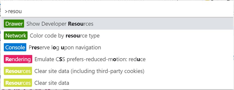
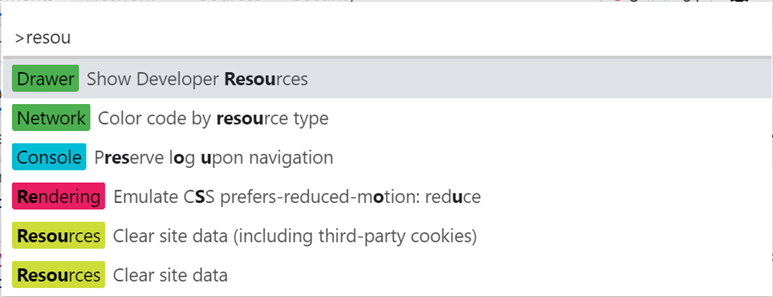
DevTools has a fairly complicated user interface, and it uses a lot of different colors, to make differences in content more obvious. One example of which is the command menu:
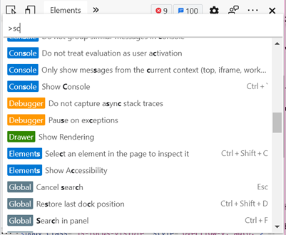
This menu lists commands that match what the user types in the input field. Every command has an associated category which is represented by a colored badge displayed next to it. This badge also contains the category name so we’re not relying solely on the color, which would be an accessibility barrier for people with low vision or color vision deficiencies.
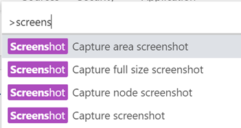
That said, we’re not quite out of the woods yet. The bug and its fix we would like to describe here is related to the fact that some of the badges didn’t have sufficient contrast between their background and text colors.

The screenshot below shows that the “Resources” badge has a very low color contrast ratio (1.511:1). The WCAG2.1 guidelines say that, at a minimum, the contrast ratio needs to be 4.5:1 for users with low vision to be able to read the text.
According to the W3C Accessibility Requirements for People with Low Vision, there is an estimated 246 million people worldwide who have low vision. Among them might be a lot of potential DevTools users who would have missed out on those badges if we hadn’t fixed that bug. In addition to that, making these more readable is what everyone can benefit from.
Setting up
The Resources badge wasn’t the only badge with low contrast, and in total there are 17 different badges. We needed to find all the contrast issues and – if needed – fix them using DevTools.
One thing not a lot of people know is that you can use DevTools to inspect DevTools! This means you can open DevTools, undock them and open a second instance of DevTools that targets the first one. From that second instance, we can inspect the badges and make color changes like you would change any other color on a web page.
Lately, we’ve improved our development environment to make this quite fast, but it was still going slow and repetitive work. We had many colors to change, and every time we would make a change to the source code, we’d have to rebuild and reload DevTools, re-open the command menu, and test the contrast.
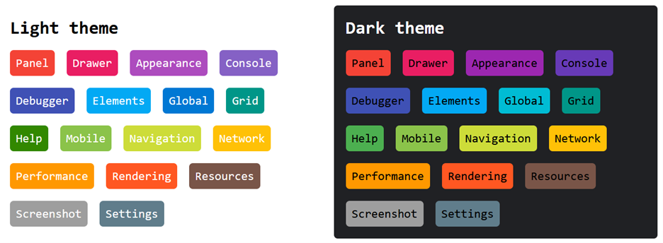
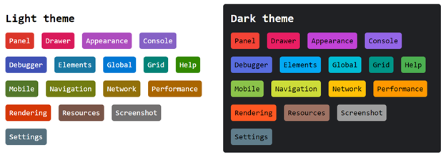
We needed a way to look at all badges all at once in order to make the necessary adjustments instead of testing them one by one.
To do this, we created an HTML document that contained all the possible badges, in both themes:
Testing contrast
We used 3 different techniques to test color contrast in our HTML page.
In DevTools
DevTools has a built-in contrast feature. If you start the inspect element mode, you can hover over elements in the page, and DevTools will show a little popup that follows your cursor and indicates the color contrast of the hovered element you even get a green checkmark next to those with enough contrast and an exclamation icon next to problematic ones.
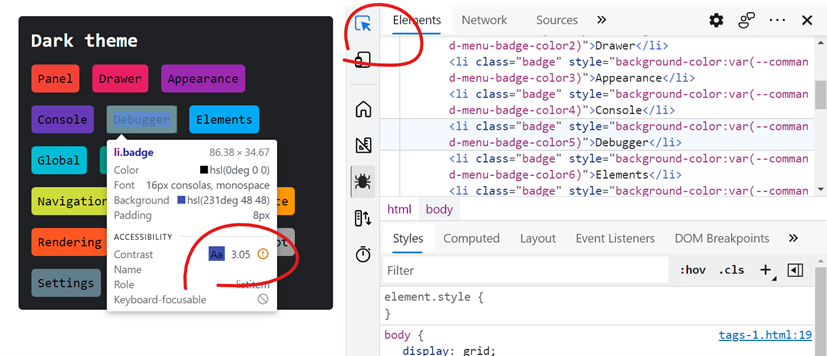
This worked great, but it also meant we needed to hover over each and every badge, one at a time, in order to check for contrast. So we tried a second technique.
Using the Accessibility Insights extension
Since we had 17 different badges to check, in 2 color themes, we needed something a little faster.
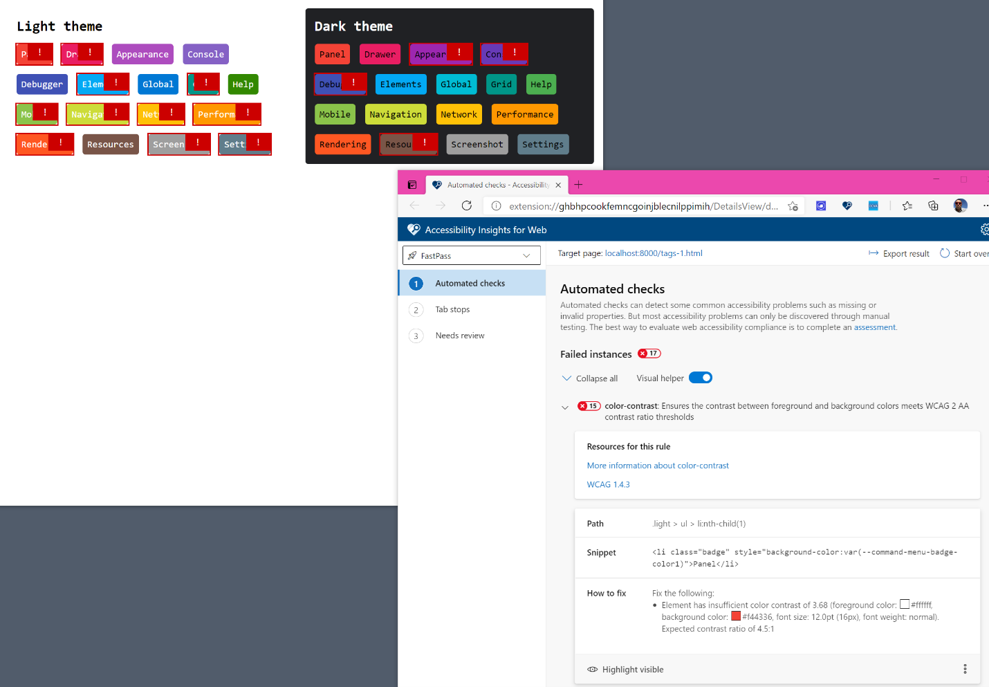
The Accessibility Insights tool comes as a browser extension (for both Google Chrome and Microsoft Edge) that, among other things, can check for color contrast issues. We use this extension in our audits of new products as it provides automated and guided accessibility test flows.
Using the extension, we were able to run a scan of the entire page, and it reported 15 contrast issues all at once.
While this browser extension was very useful, we lacked one more thing to make the fix easy to do. We needed to be able to make adjustments to the colors and see the resulting contrast in real time.
Our custom color contrast checker
We borrowed some of the contrast calculation code from DevTools (the DevTools front-end code is in JavaScript and TypeScript, which made it straightforward) and added it to the local web page.
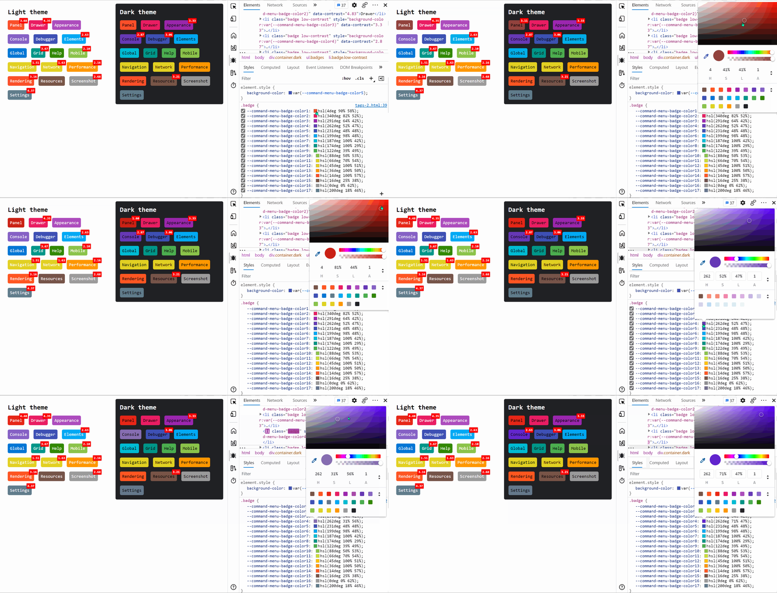
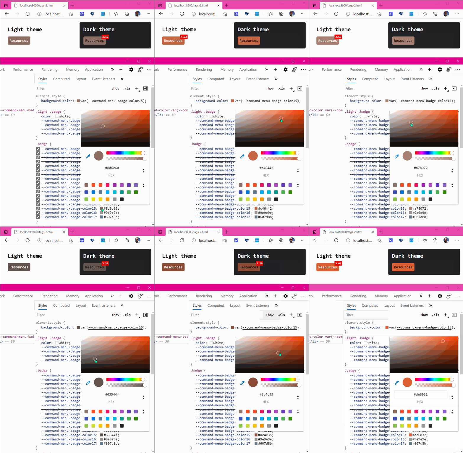
Wrapping the calculation code in an interval to display warnings in the page directly meant that we were now able to change colors in DevTools and see what the new contrast ratios were without having to reload the page.
You can try the demo page in action or look at the source code.
One interesting technique we used to show the contrast in the page was by using data attribute on the badges. We calculated the ratio for each badge and then set it on each badge like this:
badge.dataset.contrast = ratio;
Using a CSS pseudo-element and the attr() function we could then display the contrast value directly from CSS without needing any other DOM elements:
.badge.low-contrast::before {
    content: attr(data-contrast);
    position: absolute;
    background: red;
    color: white;
    /* ... */
}
The fix
Now that we had a very comfortable environment to work in, we could make the required color changes.
Practically, this meant opening up the color picker in DevTools for a given badge, and raising or lowering the luminosity of the background color just enough so that the contrast ratio became at least 4.5:1.
We ended up with the following colors:
We weren’t entirely happy with the results though. With DevTools in Light theme, the label inside the badges was displayed in white text and, for the contrast to be sufficient, we had to make the background colors quite a lot darker than they were. While we started with saturated colors that really popped we had to change them quite drastically and the result is that they now looked a bit muted. A few of the colors looked kind of brown, less pleasing to the eye, and some became harder to differentiate from others.
In Dark theme however, because the text was black, the background colors needed to be a lot lighter and this gave us a lot more freedom. The colors looked better, and still quite different from each other.
We therefore decided to always use black text for the badges, no matter which DevTools theme was selected. This way we could use the nice colors, preserve a nice user interface while being accessible to all.
The other advantage that came with this decision is that we didn’t need to have 2 sets of CSS variables now. Previously, we had 17 colors for Dark theme, and had to override some of them for Light theme. Others worked well for both black and white text. In trying to fix our contrast issues, we realized that it wasn’t always possible to have just one background color that works fine with our 2 text colors.
With just one single text color, we didn’t have that problem, and we only had to maintain 1 set of CSS variables.
The result
After applying the color changes to the DevTools source code, we went from this:
To this:
Now all the badges have sufficient color contrast ratios and we can be sure that the category names are accessible to all users.
More good news about contrast in web pages
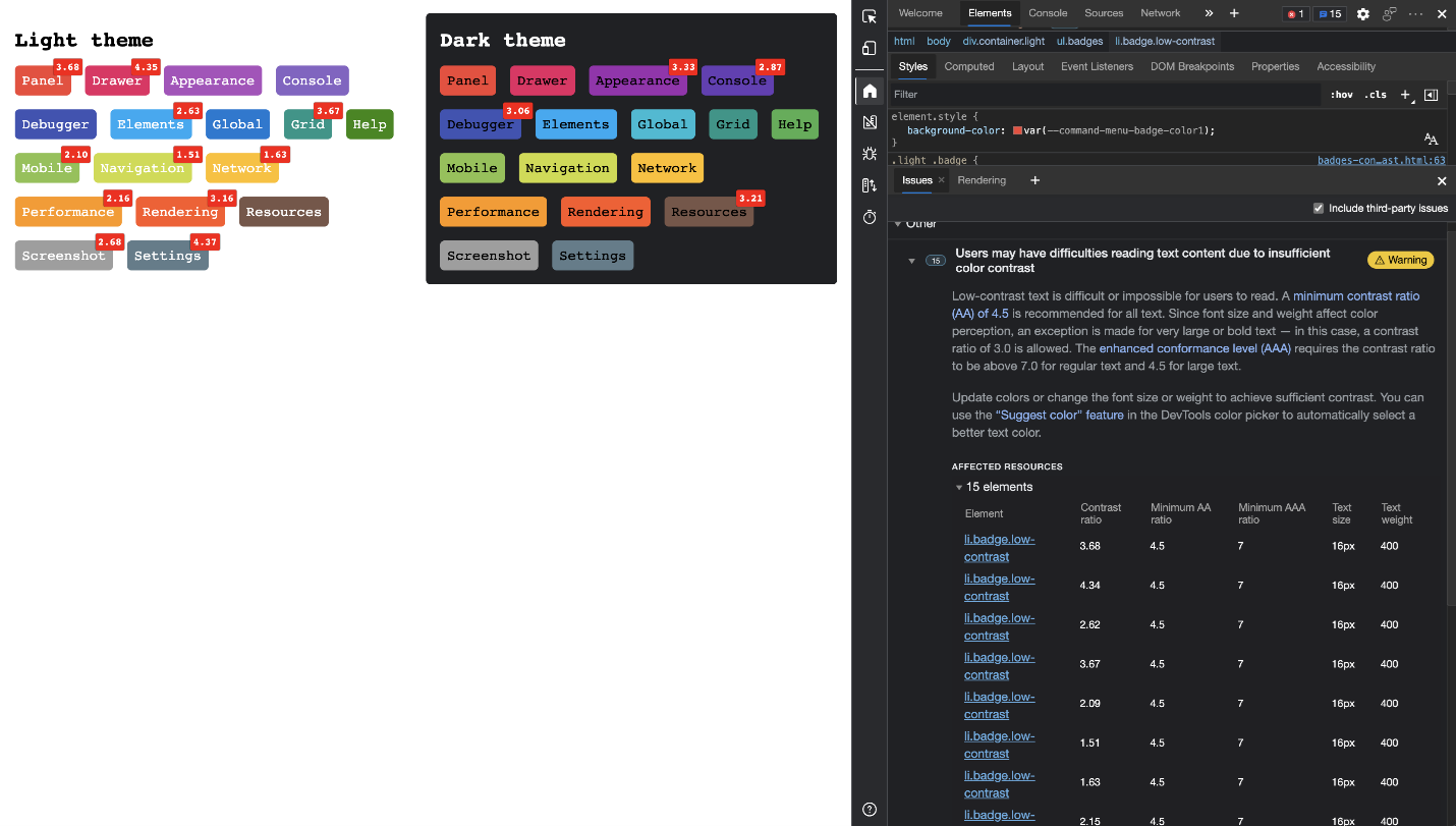
Currently there is a lot happening in the accessibility tooling space when it comes to contrast. If you want to take a look at what’s coming next, check out the new color contrast algorithm experiment. This is an improved way to determine contrast that takes into account the weight of the text. Furthermore, as part of the Chromium project, an Issues pane experiment now automatically reports color contrast issues for the whole document. Using this feature means you don’t need to code some extra page to test a lot of contrast issues at once any longer:
Closing thoughts
Fixing this bug shows that when it comes to accessibility, a lot of the problems you need to fix are part of the interaction. A purely automated process can report a contrast issue on one element but we needed to take a look at all the available badges to fix the overall experience and not only one reported bug.
We also learned that just because something wasn’t reported as an issue, doesn’t mean everything works. Being diligent about accessibility means constantly checking all the features of your tool and not only new ones, especially when you deal with legacy products or those with several owners and contributors.
The interesting thing here is that we didn’t any third party tool to inspect and fix the developer tools as the in-built contrast checker got us almost all the way where we needed to be. The Inspector tool is incredibly powerful as it doesn’t only show you all kind of information about the element like tag name, dimensions and padding but also gives you accessibility insights. In addition to the contrast information you also get the name and role of each element and a check if it is keyboard accessible or not. This is a great first check to ensure that the thing you see on screen is also available to users who can’t see it or aren’t able to use a touch screen or mouse.
Accessibility testing isn’t about compliance—it means finding flaws in your product and fixing them for a certain need, and thus making everyone benefit.
At Microsoft we’re lucky to have a dedicated team of testers and well established processes to ensure our products are accessible. But even lacking that, you can do a lot as a developer to ensure you don’t create barriers by checking your work using DevTools.
If you like to learn more about the accessibility features in developer tools, head on over to our documentation, where we’ve recently launched a new accessibility testing guide to walk you through DevTools features you can use to test for accessibility issues. Watch this space, as there is a lot more to come! You can also always contact us on Twitter at @edgedevtools to ask questions or share feedback. Happy testing!
– Patrick Brosset, Senior Software Engineer, Microsoft Edge DevToolsOverview of accessibility testing using DevTools
Source: Improving contrast in Microsoft Edge DevTools: A bugfix case study



Leave a Reply