Responsive Web Design with WURFL and NGINX Plus
Responsive Web Design (RWD) has been around for some time, making it through the “hype cycle” and finding its way to the “plateau of productivity”. With responsive web design, web developers now possess frameworks and guidelines on how to make their design adjust dynamically to the browser window and, to some extent, to the form factor of users’ devices.
However, all that glitters is not gold. Handling images in RWD has emerged as the major issue to address when website performance matters. In the case of classic one-size-fits-all image content, web developers are left with presenting a high-resolution image to serve desktop, tablet, and smartphone users.
If you add to this the fact that those users may be accessing a site through a flaky mobile connection, you can imagine that this approach may result in a frustratingly slow user experience for a large portion of users. Not only are networks often slow, but pages with a large memory footprint also result in slow rendering and difficulty in scrolling – the device feels unresponsive as you try to interact with the service.
It’s not only the user who’s affected by slow page loading times. Google uses page loading times in determining search engine rankings. So having slow page loading times not only frustrates users when they get to your webpage – it might mean that they never get to it in the first place!
Addressing Slow Page Loading Times
Initial approaches to mitigating the issue were techniques such as polyfills, CSS hacks, and JavaScript libraries. A few years later, responsive images (the element) were introduced to address the same issue in a more standard way. Thanks to the element (and the target=”_blank” attribute), developers can provide references to multiple versions of an image and count on (recent) browsers picking the right one for the current browsing context.
Old browsers aside, here’s a typical scenario of how responsive images are served with the picture element:
<picture>

  <source media="(min-width: 40em)"

    srcset="big.jpg 1x, big-hd.jpg 2x">

  <source

    srcset="small.jpg 1x, small-hd.jpg 2x">

  <img src="fallback.jpg" alt="">

</picture>
Old browsers will default to fallback.jpg, but newer browsers can evaluate the context and request the image that makes the most sense. Readers of this NGINX blog may be able to recognize this as the basis for a smart trick that enables NGINX to serve resized images through the Image Filter module.
Using the filter, you can specify the necessary sizes in the markup and, through configuration, we can have the image URLs piggyback the directives that the filter needs for the resizing.
The above technique is great, but it relies on several hefty assumptions on how the web content is organized and managed. For example, it assumes that the images are organized in files and that they have been placed in folders on the server. There are multiple reasons why this may not be not possible, particularly in large organizations. Some of them are:
- Existing graphical assets are managed through a CMS (Content Management System) – that is, there are no static files that one can manipulate or rename automatically
- Editing HTML to repurpose images may not be a viable option
- Existing web content won’t easily lend itself to reorganization
For those who experience the limitations above, the element isn’t the solution to the problem. At best, it can be regarded as a mechanism that redefines the problem. With responsive images, multi-serving images is no longer a technology problem, as it was previously, but rather one of having an editorial team that can select breakpoints, create different image versions, and manage an ever-expanding library of image assets.
The challenge is that the images – that is, the correct version of each image – need to exist somewhere, and that these image versions must be lightweight and have good visual quality across all devices out there. But that’s not all. The Web is increasingly diverse. New devices will require new sizes or formats, while older formats and sizes may become obsolete over time. A bit of forward thinking may, at this point, be desirable.
Introducing ImageEngine from ScientiaMobile
This is where ImageEngine comes to the rescue. ImageEngine is a dynamic image optimizing Content Delivery Network (CDN) with extra logic in the edge servers – that is, the CDN nodes that make up the CDN and that ensure proximity to client applications. Thanks to this edge logic, ImageEngine will optimize the image according to the size and properties of the requesting device.
More specifically, ImageEngine utilizes device detection to determine optimal size and format to resample/optimize images to a device’s screen size and properties. Device detection leverages a combination of the WURFL Device Description Repository and Client Hints. The combination of the two achieves the best of both worlds in combining known device properties and properties that are only known at run time, such as connection type or the wish that data should be saved.
For example, ImageEngine can compress more aggressively – creating lighter images, for example – for HTTP clients that access the service through a low-bandwidth connection. While these optimizations happen in real time, the CDN ensures that images are cached close to the agents that may request them.
The use of WURFL allows ImageEngine to handle mobile traffic without additional responsive image HTML tags. WURFL will also supplement Client Hints for browsers that do not support them.
In this blog post, we illustrate two scenarios in which NGINX Plus and ImageEngine can work together. The first scenario is a simple, yet effective way to offload image serving to the ImageEngine CDN using a simple NGINX Plus configuration that rewrites the image URL. This scenario requires no further modules or additional software.
The second scenario is more advanced, and it relies on the availability of the WURFL InFuze Certified Module for NGINX Plus. In this more advanced scenario, WURFL supports the specific business model of an organization by relying on explicit ImageEngine directives.
A prerequisite for the first scenario is the availability of an ImageEngine license. The second scenario will also require access to the WURFL NGINX Plus Certified Module. Both can also be obtained at www.scientiamobile.com for trial.
Scenario 1: Direct Image Requests to ImageEngine
In your NGINX configuration, you simply direct all your image requests to your unique ImageEngine hostname that was obtained as part of the ImageEngine account sign-up procedure. In the examples below, we’re using try.imgeng.in hostname. This is a publicly available account for anyone who wants to try out ImageEngine.
When serving images through this hostname, all images will automatically be optimized for the requesting device or browser. However, try.imgeng.in has some limitations, so we do recommend signing up for your own trial account to get the full flavor.
Add this code in the server section to redirect all images URL to ImageEngine:
location ~ .*.(jpg|jpeg|gif|png|webp).*$ {

  if ($arg_optimize != no) {

     return 301 http://try.imgeng.in/http://$http_host$request_uri?optimize=no;

  }

}
By using the optimize=no parameter, we get the unprocessed image:
<body>

        <Redirect
        <Request for image below is redirected to imgeng.in for processing.
        <img style="max-width: 100%" src="ie1.jpg"/>

        <p>Request for image below is returned as is.
        <img style="max-width: 100%" src="ie1.jpg?optimize=no"/>

</body>
This simple configuration change will help users experience lighter and faster loading pages.
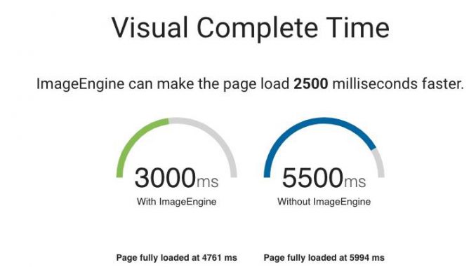
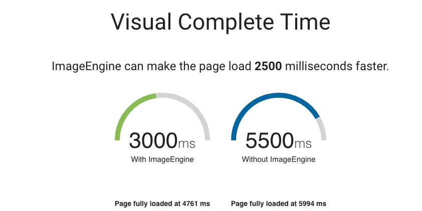
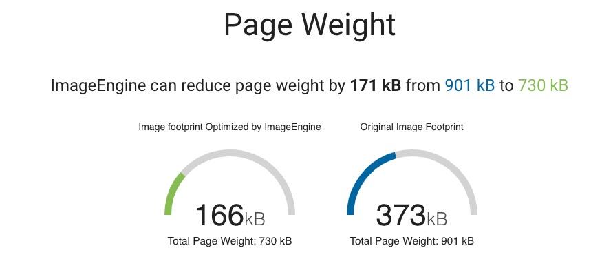
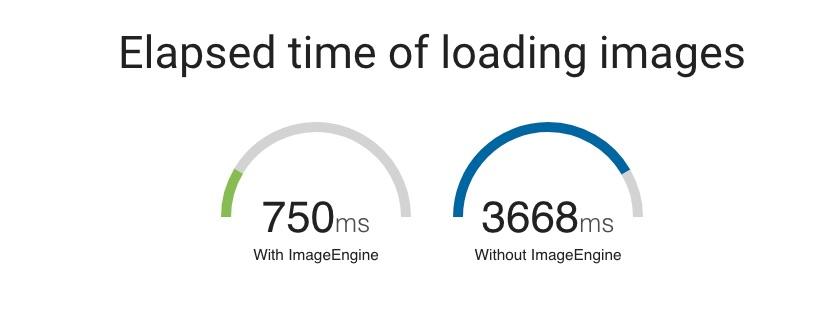
The effect of ImageEngine will vary depending on the nature of the site where it is being deployed, but, to give an idea, we ran the web shop outnorth.com through the ImageEngine demo tool.
The demo tool is based on the open source WebPageTest.org and analyzes the performance of a website both with and without ImageEngine optimization. The tool produces several interesting metrics to look at. An important one is how fast the page is visually complete so that users can start reading content and interacting with it. WebPageTest has a metric, based on “speed index,” that delivers exactly this:

Scenario 2: Exploit WURFL to Fine-Tune Images with Custom Logic
As explained, ImageEngine will, by default, use client hints and device information to decide how a picture should be optimized. But this is not the only way to use the tool. ImageEngine can also take explicit directives that instruct it on how to treat each image. While not all directives disable the device detection function in ImageEngine, most do. Directives are essentially a way to tell ImageEngine that the programmer knows what they are doing and that they want to override ImageEngine’s built-in intelligence for resizing.
Directives can dictate compression rate, format, height, width, cropping, fitting, and other features of the image. ImageEngine will handle most aspects of optimizing the image automatically, but some directives are useful when designing the site.
For example, you may want to specify the exact width and the height of the image in the URL that retrieves the image:
try.imgeng.in/http://example.com/img.png?imgeng=/w_800/h_500
Directives are passed to ImageEngine with query string parameters. In this specific case, the image should be 800 pixels wide and 500 pixels high. Once you lock the image size this way, all devices and browsers will get the same image regardless of their properties. That’s unless you can support your own device intelligence, which is exactly what NGINX Plus users can do with the InFuze WURFL Module. The InFuze WURFL Module will augment NGINX Plus with device detection capabilities. Those capabilities can be used to create URLs containing directives that change on a per-device basis.
Note: Installation instructions for the InFuze WURFL Module can be found at: https://docs.scientiamobile.com/documentation/infuze/infuze-nginx-module-user-guide
Here’s a sample NGINX Plus configuration (typically stored in /etc/nginx/nginx.conf) that shows how HTTP requests can be enriched with additional device information:
http {

    wurfl_enable    on;

    # -- WURFL Data file load

    wurfl_root      /usr/share/wurfl/wurfl.zip;
    # Increase the variable hash size

    variables_hash_max_size 1024;

    variables_hash_bucket_size 1024;
    # -- WURFL cache: one of the following

    #wurfl_cache_null;

    wurfl_cache_double_lru 100000,30000;
    # -- WURFL user requested static capabilities (as an example, this is not a complete list)

    wurfl_request_capability resolution_width;

    wurfl_request_capability resolution_height;

}
The configuration above will make the resolution_width and resolution_height capabilities of the requesting device available in the NGINX resolution_width and resolution_height variables respectively.
These variables can be leveraged to instruct ImageEngine to serve images whose size conforms to the screen size of the requesting device.
try.imgeng.in/http://examle.com/img.png?imgeng=/w_$wurfl_cap_resolution_width/h_$wurfl_cap_resolution_height/We need NGINX Plus to dynamically perform this translation. We can also use this step to make URLs prettier through URL rewriting. In the process, we would also like to remove references to imgeng.in so that we can refer to images with URLs that appear as simple as:
//images.example.com/img.png
The NGINX Plus configuration is an example of passing a resolution image to the imgen.in service and rewriting the URLs. This configuration snippet can be added to an existing .conf file in /etc/nginx/conf.d as part of a larger server block.
location ~ .*.(jpg|jpeg|gif|png|webp).*$ {

  if ($arg_optimize != no) {

     return 301 http://try.imgeng.in/w_$wurfl_cap_resolution_width/h_$wurfl_cap_resolution_height/http://$http_host$request_uri?optimize=no;

  }

}
This setup will make sure that images are never larger than the resolution width of the screen, which might be useful, for example, in the case of hero images or images used for background.
WURFL is not only about device screen size – it also contains a variety of other properties that can be leveraged for other types of optimization, for Ad Tech, and for Analytics.
Summary
This post has discussed the benefit of server-side device optimization for the purpose of minimizing the payloads of web pages accessed through mobile devices.
We’ve shown how device detection can be used to implement custom policies for resizing and optimizing images in a responsive web design context. It’s worth noting that these are just example scenarios in which device detection can be deployed. Several others are possible. The NGINX Plus WURFL Module can be used to create scaled-down, snappy versions of your content for smartphones, or even feature phones.
Augmenting HTTP requests with device information is a simple strategy to optimize user experience based on the form factor of the device and HTTP client. Depending on what service you offer, you may want desktop users, tablet users, and smart TVs to navigate your site differently. Device detection can help you segment your offering in ways that better fit your organization or your business model.
ScientiaMobile’s ImageEngine is a great starting point that will offer benefits out of the box, but NGINX Plus users can also benefit from adopting the InFuze WURFL Certified Module for NGINX Plus.
The WURFL module enriches NGINX Plus and enables new policies based on the actual features of different HTTP clients. We have shown a scenario in which the WURFL Module for NGINX Plus works with ImageEngine to implement customized policies for image optimization and improve user experience.
While the image optimization use case is pretty compelling, we’ve also mentioned that device detection has a variety of other uses, particularly when used in connection with the powerful NGINX Plus machinery.
The post Responsive Web Design with WURFL and NGINX Plus appeared first on NGINX.


Leave a Reply