Build your first WinUI 3 app (Part 1)
As part of the Windows App SDK, WinUI 3 provides a modernized UI framework for building Windows 10 and Windows 11. This 3-part blog aims to help members new to Windows development quickly build familiarity using the Window App SDK through a fun sample app.
This post is only part 1 of the 3-part Windows App SDK blog and is scoped to showing you how to use WinUI 3 controls to create a simple working user interface. Part 2 and 3 are for windowing and single instancing.
Sample app overview
We are going to build an app with buttons that produce drum sounds (DrumPad). As simple as this demo app is, it shows some cool things you can do right away with the Windows App SDK (WinAppSDK):
- Working with simple and easy-to-use UI controls from Windows UI Library (WinUI) 3
- Customizing windowing options so that the user can multitask with the app always on top or have a full immersive experience
- Making the app single-instanced to reduce synchronization issues between instances
Prerequisites
- Install tools for developing apps for Windows 10 and Windows 11 here.
- Create a WinUI 3 app using the Blank App, Packaged (WinUI 3 in Desktop) template, and name it DrumPad.
Project template structure
In the WinUI 3 project template, most of our code will live in MainWindow.xaml and MainWindow.xaml.cs
- MainWindow.xaml is a XAML file where we will define all of our UI elements, called “controls”, that will make up the visual layer of our application.
- MainWindow.xaml.cs is the C# code-behind file where we will put all the logic that lets us interact with our application.
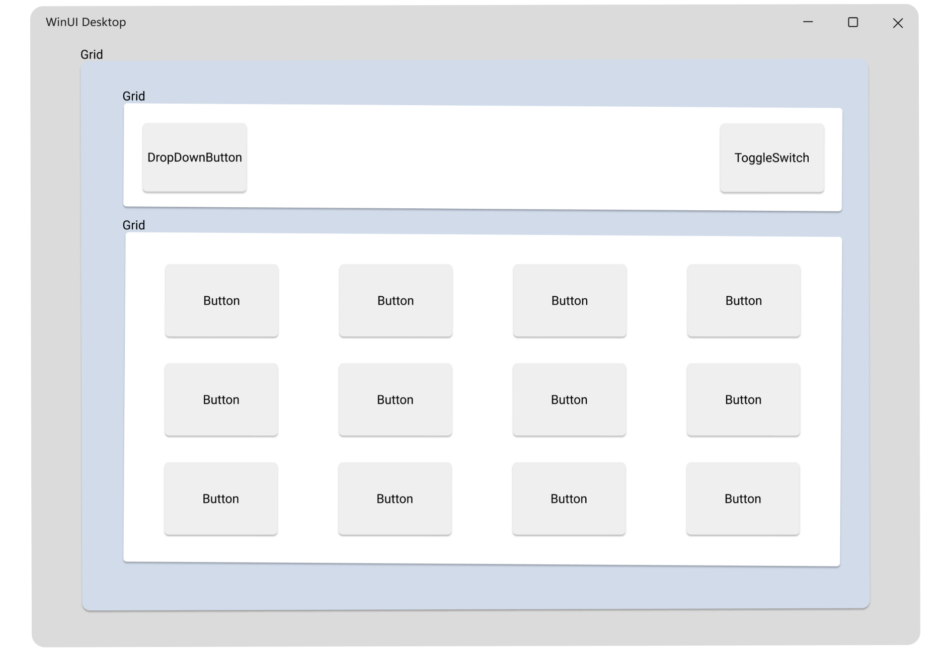
UI layout design
The following WinUI 3 controls are used to represent components of a drum pad:
- DropDownButton: includes a chevron to indicate a menu can be opened
- ToggleSwitch: a switch that can be toggled between dark/light mode
- Button: has a click user interaction and will trigger a unique drum sound
- Grid: made of rows and columns and is used to position the other controls
Deleting partial template code
The default project template comes with some blocks of code you’ll want to delete so we can replace them with our own markup and implementation:
MainWindow.xaml:
<!-- Delete the following template code -->

<StackPanel Orientation="Horizontal" HorizontalAlignment="Center" VerticalAlignment="Center">
    <Button x:Name="myButton" Click="myButton_Click">Click Me</Button>
</StackPanel>
MainWindow.xaml.cs:
// Delete the following template code

private void myButton_Click(object sender, RoutedEventArgs e)
{
    myButton.Content = "Clicked";
}
Defining the layout
In your MainWindow.xaml we will start by defining the set of nested grids and specify their controls and positioning. Open MainWindow.xaml in the XML editor view and inside the element add this content:
<!-- Add GRID CODE -->

<Grid>
    <Grid.RowDefinitions>
        <RowDefinition Height="Auto"/>
        <RowDefinition Height="*"/>
    </Grid.RowDefinitions>

    <Grid Margin="12">
        <Grid.ColumnDefinitions>
            <ColumnDefinition Width="*" />
            <ColumnDefinition Width="Auto" />
        </Grid.ColumnDefinitions>
        <!-- STEP 1: Add DropDownButton & ToggleSwitch CODE -->
    </Grid>

    <Grid x:Name="Control1" Grid.Row="1" ColumnSpacing="30" RowSpacing="12"
          VerticalAlignment="Center" HorizontalAlignment="Center">
        <!-- STEP 3: Define column & row positioning -->
        <!-- STEP 4: Add Styling for BUTTON -->
        <!-- STEP 2: Add BUTTON CODE -->
    </Grid>
</Grid>
NOTE: Auto and * are used to specify the height and width above to create a responsive layout. The controls held within the Grids are not fixed in size and can adjust to fill in spaces as the user resizes the app window.
Setting up remaining controls
STEP 1: Add DropDownButton & ToggleSwitch:
<DropDownButton Content="Display" Grid.Column="0" VerticalAlignment="Center" HorizontalAlignment="Left" Width="118" >
    <DropDownButton.Flyout>
        <MenuFlyout Placement="Bottom">
            <MenuFlyoutItem Text="Default"/>
            <MenuFlyoutItem Text="Compact Overlay"/>
            <MenuFlyoutItem Text="Fullscreen"/>
        </MenuFlyout>
    </DropDownButton.Flyout>
</DropDownButton>

<ToggleSwitch AutomationProperties.Name="simple ToggleSwitch" x:Name="dark_switch" Grid.Column="1" CornerRadius="3" VerticalAlignment="Center"  HorizontalAlignment="Right" MinWidth="0" HorizontalContentAlignment="Center" VerticalContentAlignment="Center" />
STEP 2: Add Buttons:
<Button Background="#FF0000" Grid.Row="0" Grid.Column="0" Content="Kick 1"/>
<Button Background="#C4425A" Grid.Row="0" Grid.Column="1" Content="Kick 2"/>
<Button Background="#D41DD8" Grid.Row="0" Grid.Column="2" Content="Kick 3"/>
<Button Background="#6A21A3" Grid.Row="0" Grid.Column="3" Content="Kick 4"/>

<Button Background="#C4425A" Grid.Row="1" Grid.Column="0" Content="Clap 1"/>
<Button Background="#D41DD8" Grid.Row="1" Grid.Column="1" Content="Clap 2"/>
<Button Background="#6A21A3" Grid.Row="1" Grid.Column="2" Content="Clap 3"/>
<Button Background="#473DB8" Grid.Row="1" Grid.Column="3" Content="Clap 4"/>

<Button Background="#D41DD8" Grid.Row="2" Grid.Column="0" Content="Open Hat 1"/>
<Button Background="#6A21A3" Grid.Row="2" Grid.Column="1" Content="Open Hat 2"/>
<Button Background="#473DB8" Grid.Row="2" Grid.Column="2" Content="Open Hat 3"/>
<Button Background="#26AAC7" Grid.Row="2" Grid.Column="3" Content="Open Hat 4"/>

<Button Background="#6A21A3" Grid.Row="3" Grid.Column="0" Content="Snare 1"/>
<Button Background="#473DB8" Grid.Row="3" Grid.Column="1" Content="Snare 2"/>
<Button Background="#26AAC7" Grid.Row="3" Grid.Column="2" Content="Snare 3"/>
<Button Background="#1A7BD6" Grid.Row="3" Grid.Column="3" Content="Snare 4"/>
STEP 3: Specify how the Grid should position these Buttons:
<Grid.ColumnDefinitions>
    <ColumnDefinition Width="*" />
    <ColumnDefinition Width="*" />
    <ColumnDefinition Width="*" />
    <ColumnDefinition Width="*" />
</Grid.ColumnDefinitions>

<Grid.RowDefinitions>
    <RowDefinition Height="*" />
    <RowDefinition Height="*" />
    <RowDefinition Height="*" />
    <RowDefinition Height="*" />
</Grid.RowDefinitions>
STEP 4: Apply standardized styling to all the Buttons:
Result
As simple as that, we should have a working visual layer built out using WinUI 3 controls. Choose x64 as your target platform, then press F5 to run the project solution. You should see:
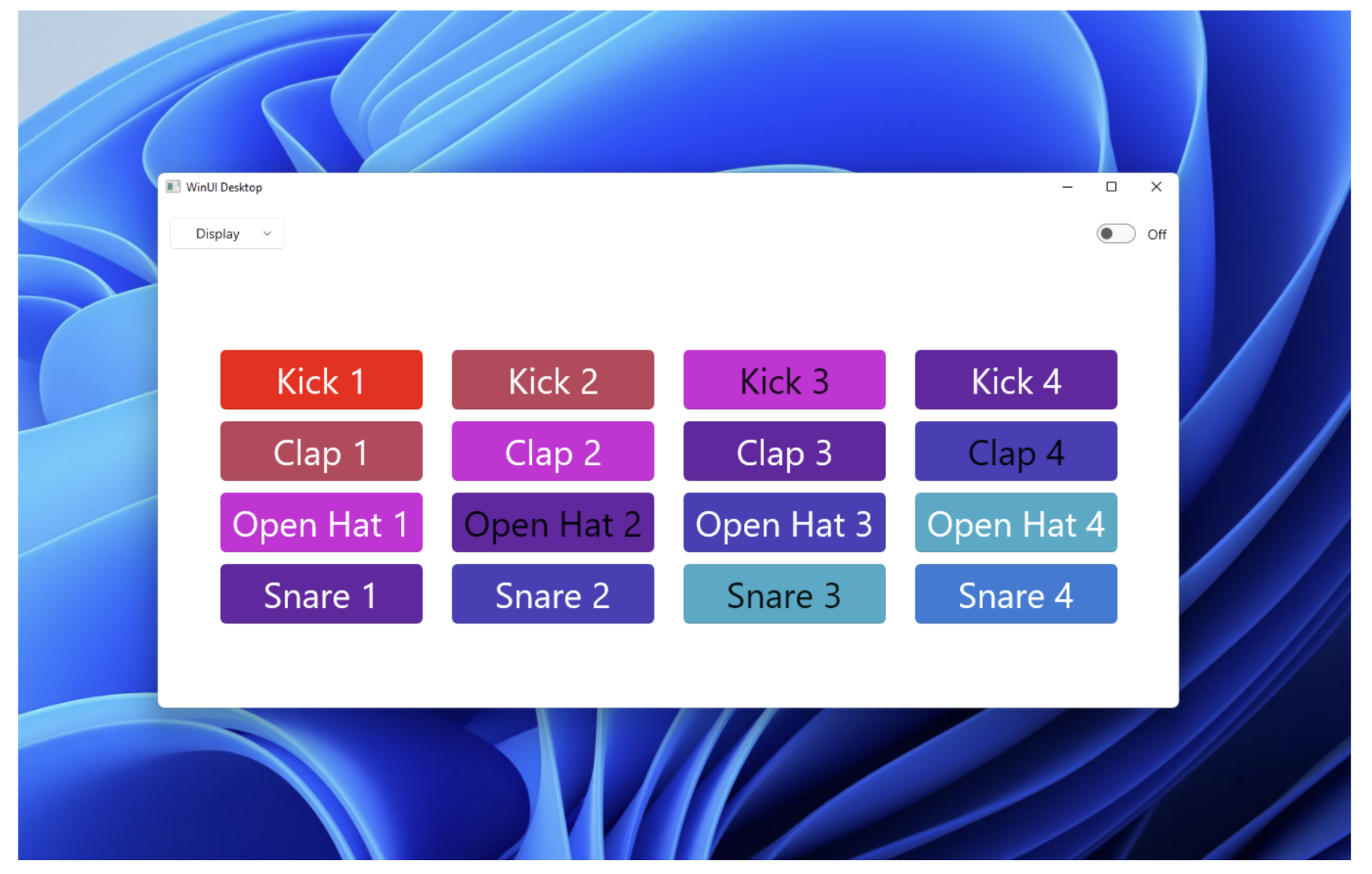
Here is the completed code used in this post.
Moving forward
The buttons don’t do anything yet, but that’s next time! In part 2 we will dive into implementing the business logic.
Source: Build your first WinUI 3 app (Part 1)


Leave a Reply